Redesign.
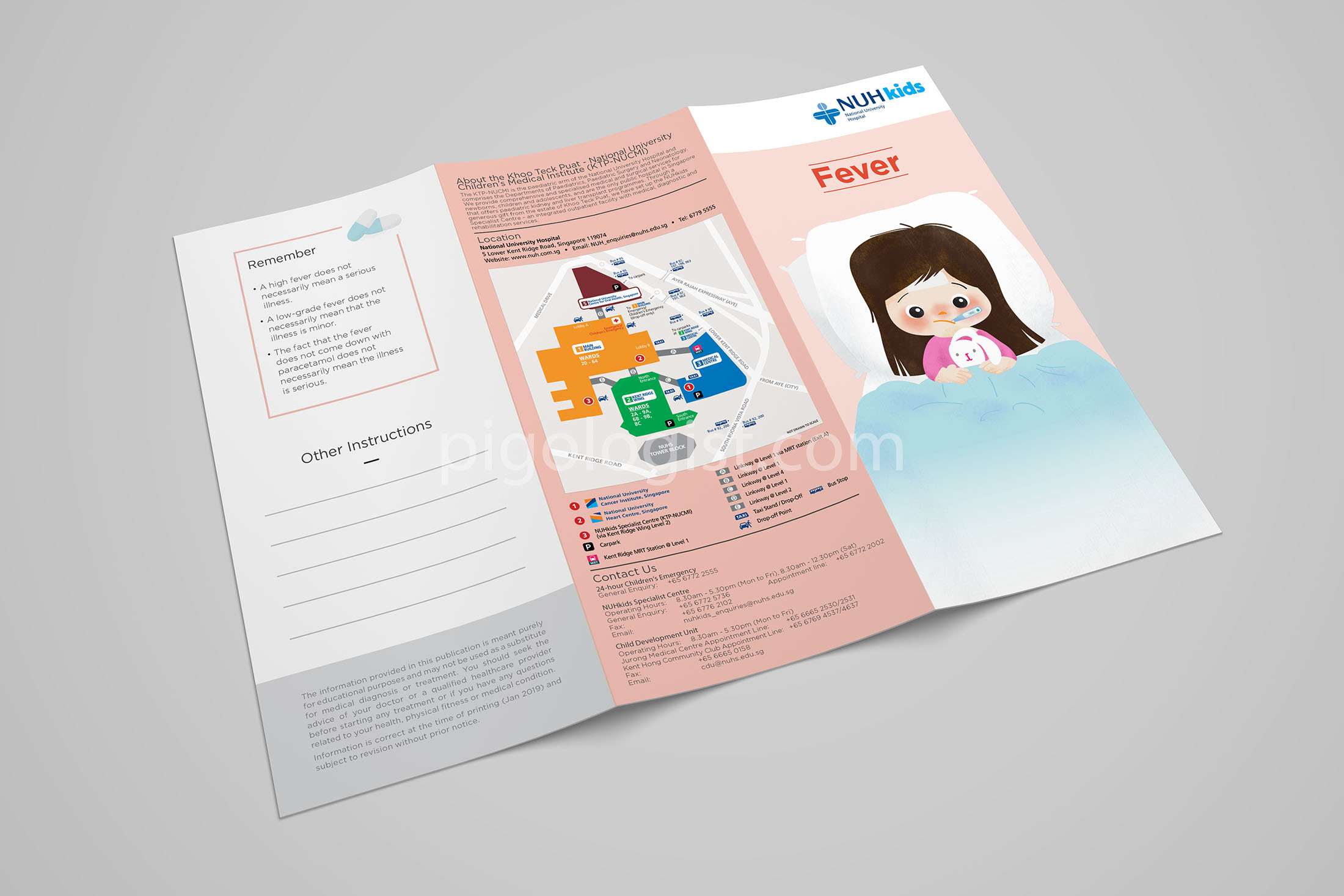
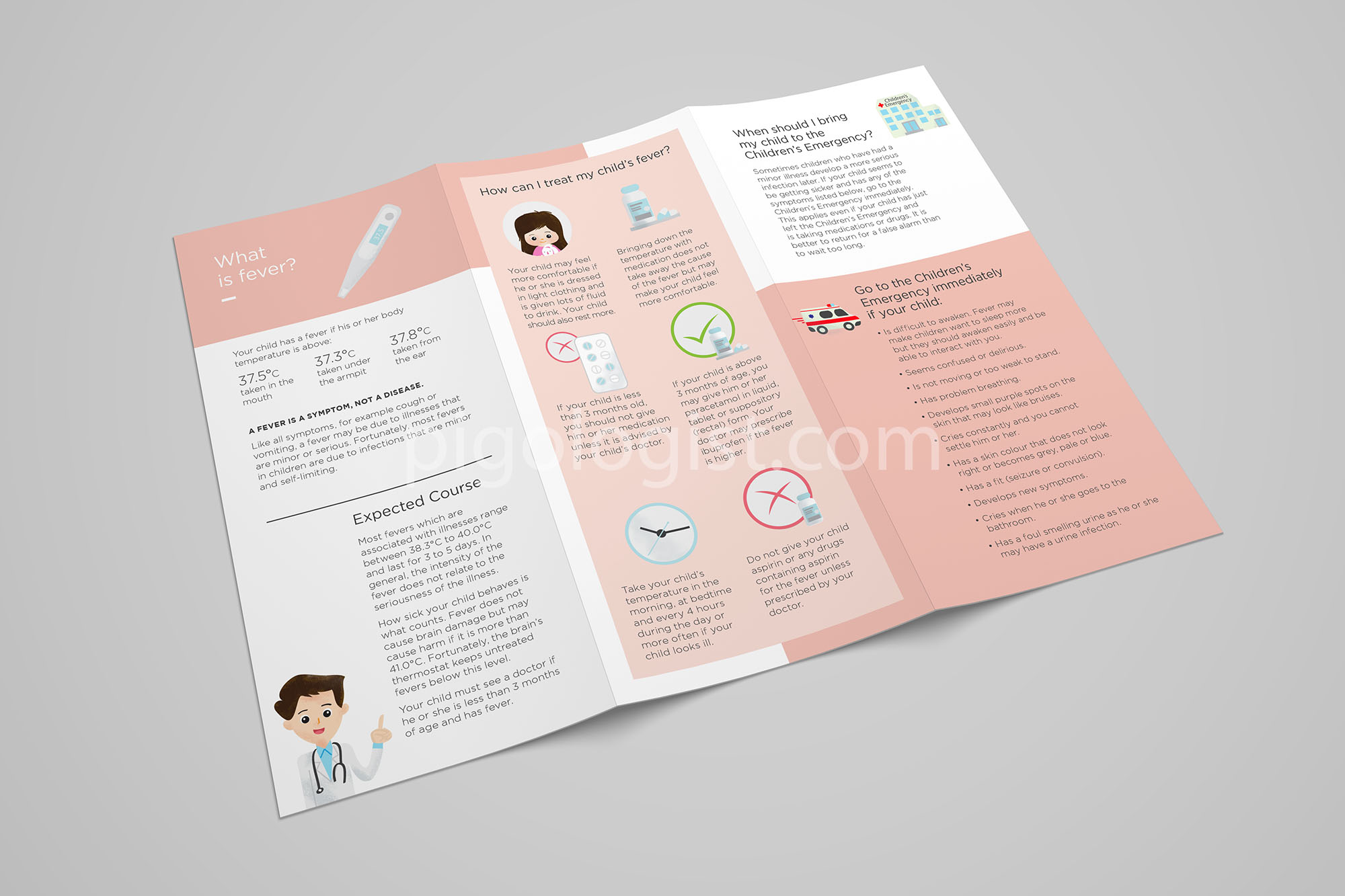
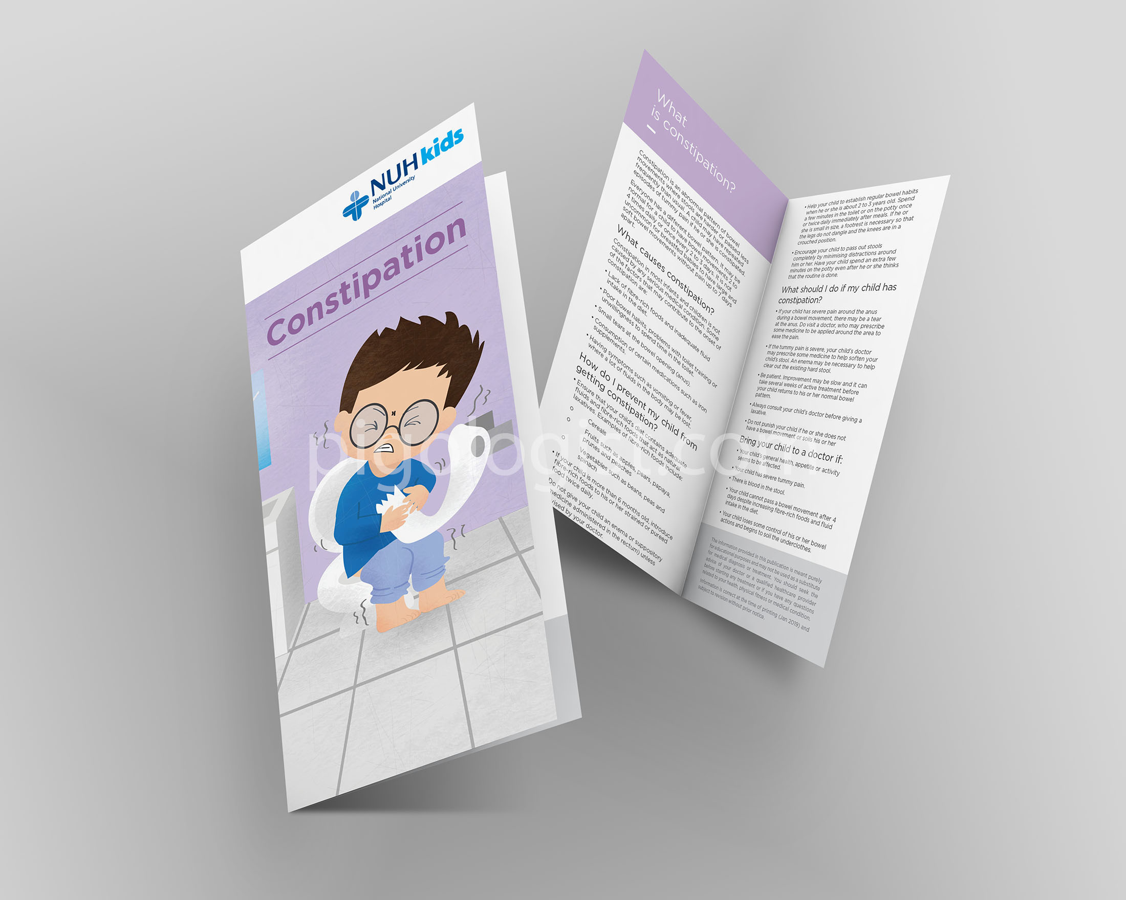
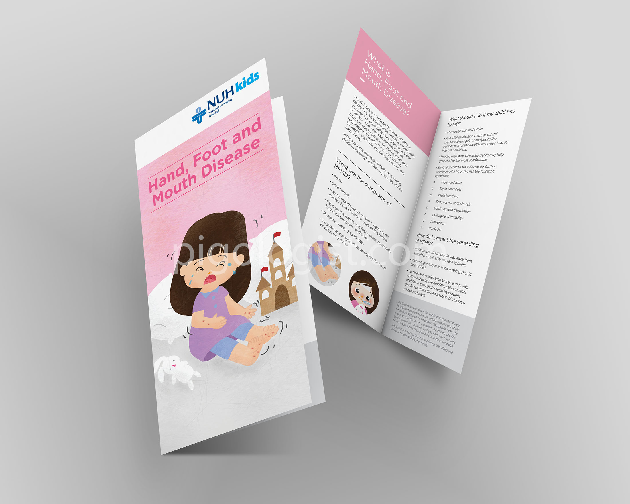
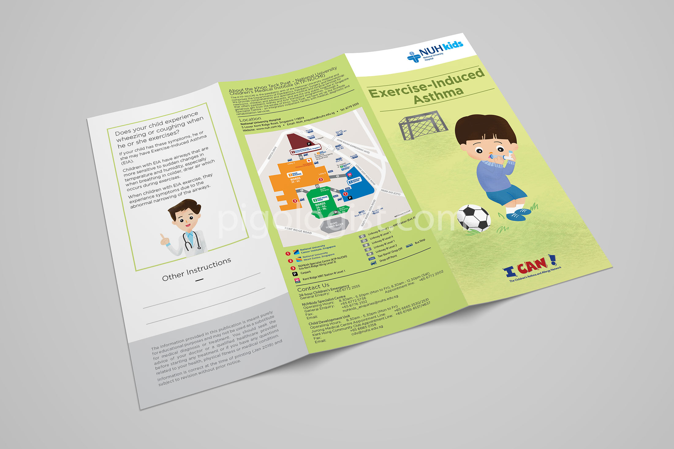
The client desired a redesign of their existing brochures, aiming to captivate patrons and encourage them to pick up a copy. The goal is to enhance awareness about common illnesses in young children and provide guidance on appropriate actions when encountered.
Illustration and brochure designs for NUH
CLIENT
NUHkids National University Hospital of Singapore
DELIVERABLES
Illustration, Layout Design, Art Direction, Graphic Design and Type-setting
CHALLENGES
The illustrations pose certain challenges; they should depict sick children without causing fear for both children and parents.
The proposed redesign idea aimed to attract patrons by employing vibrant, soft pastel colors. We suggested using multiple colors, assigning each color to a specific brochure. When these brochures are assembled, they form a rainbow of colors.
OUTCOME
Increased “pick a copy” rates of patrons, enhanced awareness and provided “easy-to-read” health into with captivating illustrations.
![PIGOLOGIST STUDIO #1 Mascot designer and illustrator [2024]](https://pigologist.com/wp-content/themes/werkstatt/assets/img/logo.png)
![PIGOLOGIST STUDIO #1 Mascot designer and illustrator [2024]](https://pigologist.com/wp-content/themes/werkstatt/assets/img/logo-light.png)
